WR Ranked Design System
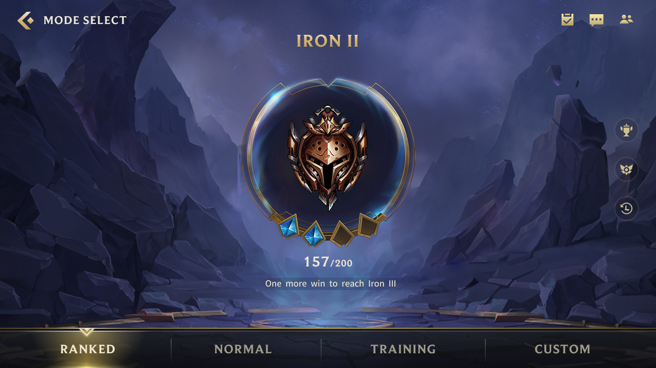
In 2019, Wild Rift's Ranked screen made you pick a door, but buried where you stood. We made the rank the subject. One ring, everything you need to know.
Three entrances (Solo, Team Match, Arena) sat side by side as equal cards and took up 70% of the screen. A new player's first decision was which door, not where they stood or what they were climbing toward. The screen led with a choice that didn't matter and buried the ones that did. Your rank, your progress, the climb. It treated your tier as decoration. There was no sense of standing, and no pull toward the next level.
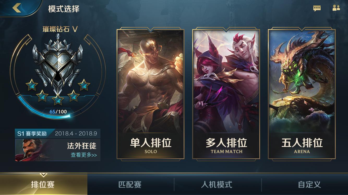
2019 Ranked entry · three doors first, your rank in the corner
We ran interviews to find what motivates players the moment they open Ranked. It is a moment of ambition. They come to measure themselves. How far have I climbed, how close is the next tier, what will it cost to break through. The pull is the climb itself. So we rebuilt the screen around that feeling. Show exactly where you stand, and make the next tier feel close enough to chase.
By collapsing three entrances into one, we made the rank the subject of the screen. Solo, Team Match, and Arena run different matchmaking. Solos queue against solos, premade teams against premade teams, because a coordinated party carries an advantage the system has to balance for. But which queue you enter is a matchmaking decision, not the first thing the Ranked screen needs to ask. We moved it downstream. That cleared the page to do one job. Hold your current rank, your score, and the distance to the next tier, with everything else minimized to quiet. The trophy helmet sits at the center as the thing you're fighting for.

Demotion flow
The original design made the rank a portal, not a badge. One ring does two things at once.
- It is the Play button. You press the ring to launch your match, so the control that starts the game is the same object that displays your rank.
- It is the scoreboard. Your tier, your division (two gems, Iron II), and your points charging toward the next step.
One component is both the door into the Rift and the readout of your standing. That was the vision V1 set out to prove.
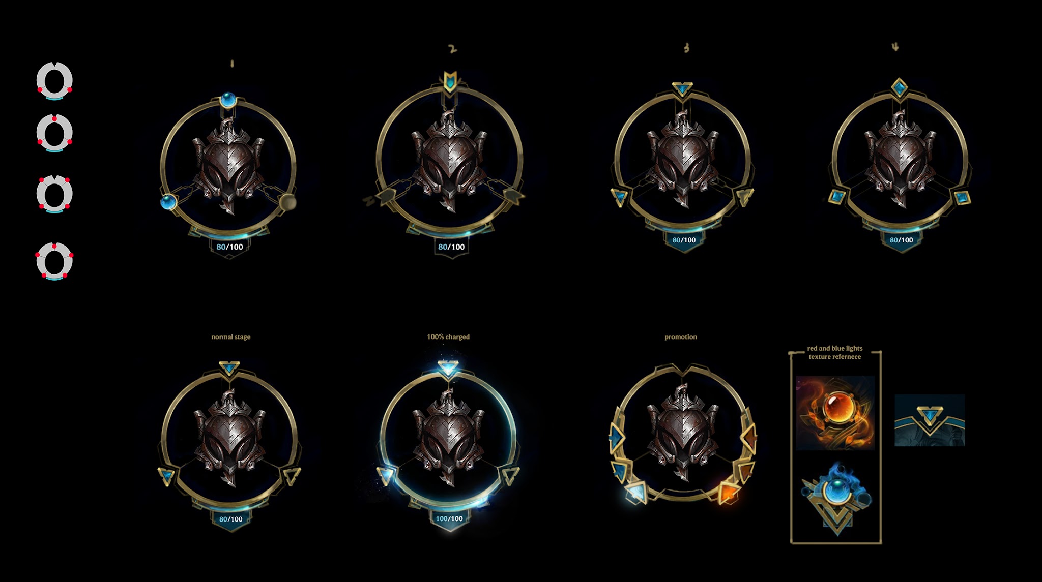
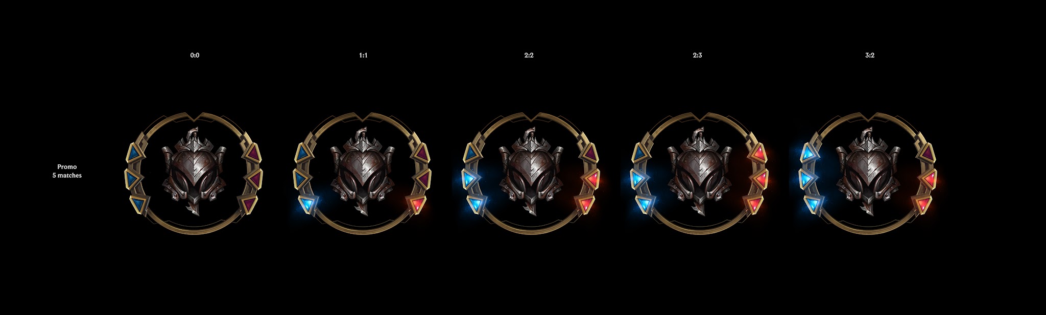
V1's most expressive state was the promotion series, the 2-5 games that decide whether you climb. The ring flips. It splits open into a row of win/loss lights, one per game, so the player reads the whole series at a glance. How many won, how many left, what's on the line. The same ring that shows your rank now shows the series, and no second screen is needed. That is what the redesign was for. High-stakes standing you grasp in a single look. The ranked ladder it sat on was later tuned simpler for mobile, where the audience climbs more casually than PC's hardcore competitors. Retiring the Promo stage was a game-design call, not a visual one.
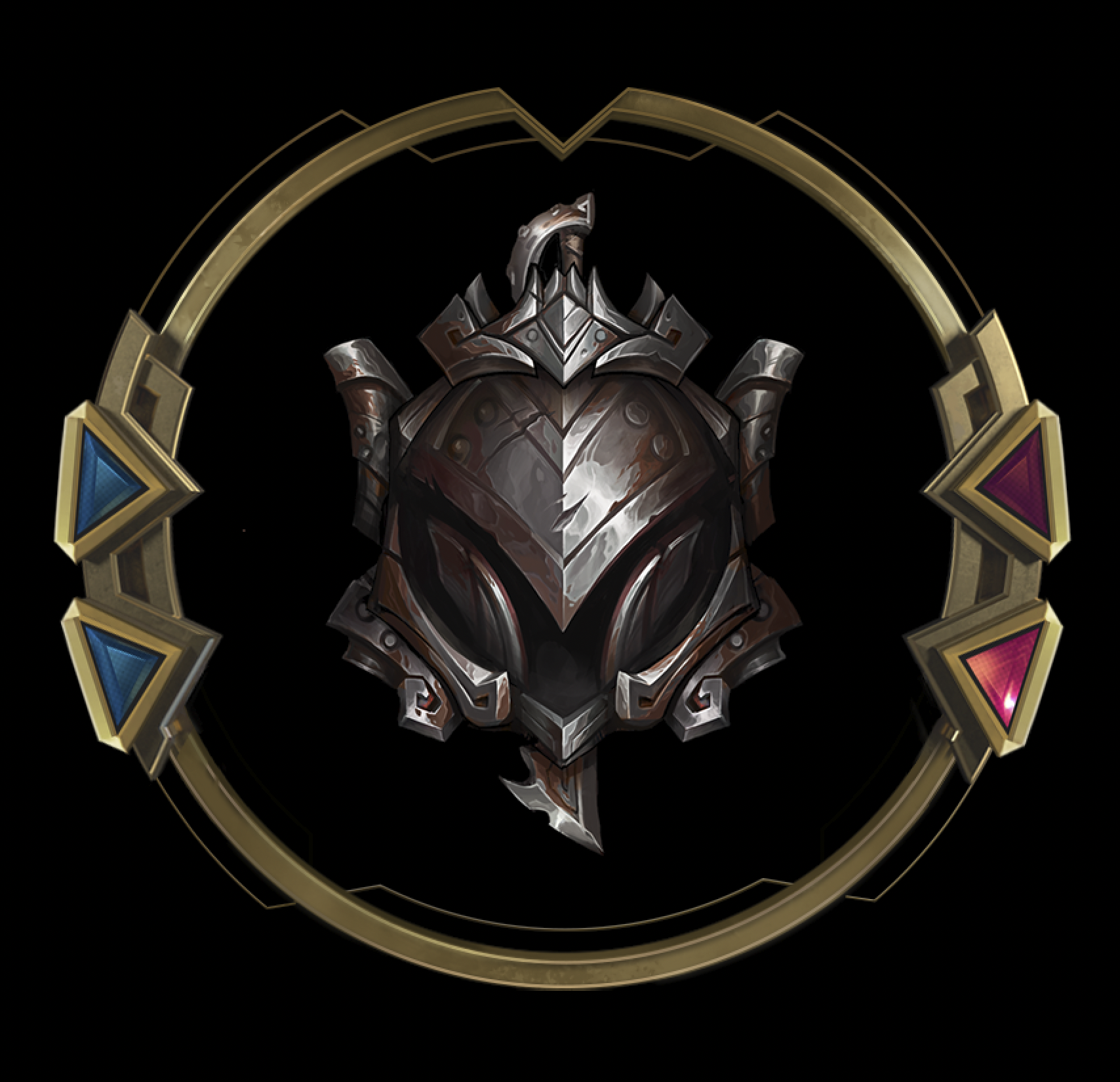
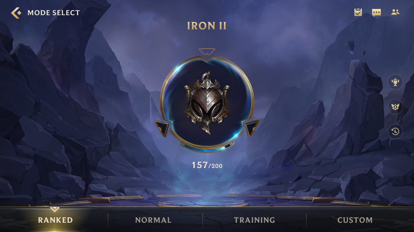
V2 rebuilt the rank to fit tight size constraints and scale cheaply. Ten ranks, Iron to Challenger, assemble from four components: the ring, the gem, the wing, and the emblem crest. Swap the parts, get the tier.
- One modular kit covers the whole ladder and keeps all ten ranks visually consistent.
- A future tier or seasonal reskin becomes a parts change, not a redraw.
The original vision became a production system, one the team can keep extending.
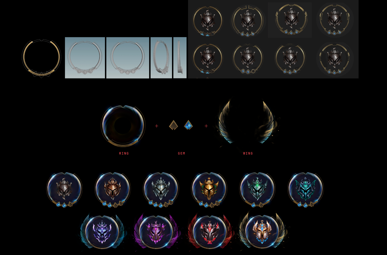
At the top three tiers (Master, Grandmaster, Challenger), the ring grows wings, a symbol that later carried into League of Legends' own ranked visual language. V2 shipped as the ranked experience in 2021, and it's still running today.